Redesigning an existing government website with an emphasis on user design experience.
Project Title
- USDA Site Redesign
Roles
- UX Researcher
- UI Designer
Deliverables
- User Proto Persona/User Persona
- User Interviews
- Problem Statement
- Heuristic Evaluation
- Ideation Documentation
- Website Annotations
- User Flow
- Card Sort/Site Map
- Mood Board
- Style Tile
- Low-Fi Wireframe
- High-Fi Wireframe
- High-Fi Prototype
- Responsive Web Design Prototype
- Five Second Test
- User Testing with User Testing Plan
Software Used
- Figma
- Photoshop
- Invision
Digital Medium
- Website Redesign

Project Overview
User testing showed that users had difficulty completing tasks due to difficult navigation and lack of clarity on the site.
Solution
The solution is simplifying navigation and adding clarity to the site so that it can be used by anyone, from legal immigrants looking to build productive lives in America to highly educated researchers.
Style & Imagery

#BF793B

#8B6A3F

#F2BF63

#40542F

#0E0E0E
")
Aa
Montserrat 36 pt
Roboto 24 pt
Roboto 18 pt
Style direction: Harvest-like, healthy, modern, warm
Proto Persona
First, as a group of three, the USDA website was examined to determine the points needed for treatment. All were notated with a Heuristic Evaluation.
One of the first tasks in the research phase was to determine who typically uses the USDA website. Although the site is not immediately clear who its audience is, upon extensive searching, it was determined that pregnant women in need of temporary food assistance used the USDA site, as well as researchers and farmers.
In this case, the proto persona is Carmen, a legal immigrant working to pursue the American dream with her husband. She is expecting a child and is looking for temporary food assistance with WIC to ensure a healthy pregnancy.


Typical User Journey
- Carmen arrives at the USDA homepage.
2. Carmen scrolls down to see a clickable icon with the title “Tackling Food and Nutrition Insecurities.”
3. She’s then brought to the page but doesn’t understand why she’s seeing a page that describes the problem more than focusing on the solution.
4. It takes her awhile, but she eventually realizes she needs to click on the “learn more” tab under the header “What is the USDA Doing? This expands a list of options. She then clicks on the icon with the title “Meaningful Support.”
5. She’s then lead to the page titled “Meaningful Support.”
6. She scrolls down the page and sees the tab to click on “Mother, Infants, and Young Children.
7. She then navigates to a page with a header that reads “Special Supplemental Nutrition Program for Women, Infants, and Children (WIC).”
8. Although Carmen wanted information on WIC, she wants to specifically know more about the new program WIC has that is partnered with local farmers’ markets, since she’s aiming at eating healthier, but she doesn’t know how to on her limited income. Since she’s not seeing this option listed on the WIC page, she types the keywords into the search bar.
- She’s then brought to a results page. She clicks on the first result.
- Carmen is then brought to the page “Farmer’s Market Nutrition Program,” which discusses WIC.
- She then sees more information as she scrolls down the page, including listings about farmers’ markets by state and additional WIC information as it relates to farmers’ markets.

5 User Interviews
Next, five users between the ages of 35 and 78, with four males and one female. All are well-experienced with technology and websites. The Researcher asked the users to find key areas on the website that should be easily located such as information WIC, and the Farmer’s Market Partnership. Two out of the five were unable to complete the tasks with each user expressing difficulty at certain points. The most difficult task to find was the Farmer’s Market Partnership as well as locating a Farmer’s Market in your area.
Users also expressed confusion over the accordion tabs on pages (it wasn’t immediately recognizable to users that the accordion tabs expanded to display more text, confusion concerning the navigation, and remarks were made concerning the boring interface.
Annotations
The website was annotated notating problematic areas and areas where the website is currently correctly implementing user design thinking. For instance, the website is implementing the use of cards, but on the downside, the website is not using accordion tabs correctly, the use of its stock images is not as purposeful as it could be, and its text is too dense without any separating elements to break-up the text.
The USDA website also did not meet color accessibility standards.
")
")

")
Sarah created a Feature Prioritization Matrix to prioritize what was most vital to the user, what was least important to the user, and what was most important to the agency, as well as the least valuable to the agency. This allowed her to ideate what needed to be executed on the project.


Card Sort & Site Map
Sarah then conducted a card sort implementing data from her user interviews. This included clarifying confusion on some of the titles in the header and footer such as “Food Insecurity” (some users were uncertain what this term meant). When asking the perplexed users if the title “Food and Nutrition Security” made more sense to them, they responded favorably. She also added pages that were necessary but not yet included on the menu such as “Recalls.”
Style Tile
Sarah created a Mood Board in Invision and a Style Tile in Figma, incorporating the look and feel of harvest-like elements that evoke imagery of health and the rural farmers devoting their livelihood to nutritional food for the public.
A new logo was also reimagined with the new harvest-evoking style direction and images were carefully selected to carry a purposeful message of health, farming, care for families, and even investigative images for those looking into the research archives.
")
")
")
")
Desktop and Mobile Wireframes & Prototype
Next, a mobile-first design complete with site icons to help the user navigate the site better, cards, a place for the blog, and partnered websites for the home page. Next, the user flow was designed on mobile.
The design was then prototyped, complete with an animated slider showcasing main selections on the site and an accordion dropdown menu for the header.
Five Second Testing and Final Usability Testing
Next, four people were enlisted to do a five-second test on the prototype.
These were the impressions from the five-second testing:
-Trustworthy
-Feels farm-like/harvest-like
-Seems to appeal to farmers and people in need of food
-Feels healthy
– It’s a site that I feel like I would like to revisit
-Seems like it’s acting as a resource
-Has a warm color scheme
-It feels like it’s easy to navigate

")
were enlisted
Final Usability Testing
In the Final Usability Testing, seven users were enlisted to conduct the tasks in the user flow. Five out of seven users had difficulty navigating to the WIC page, so this selection was added to the accordion menu. All other tasks were easily completed. Users appreciated the animated slider that led them to the selections they were seeking. Users also found the navigation easier to use in the prototype versus the original USDA website.
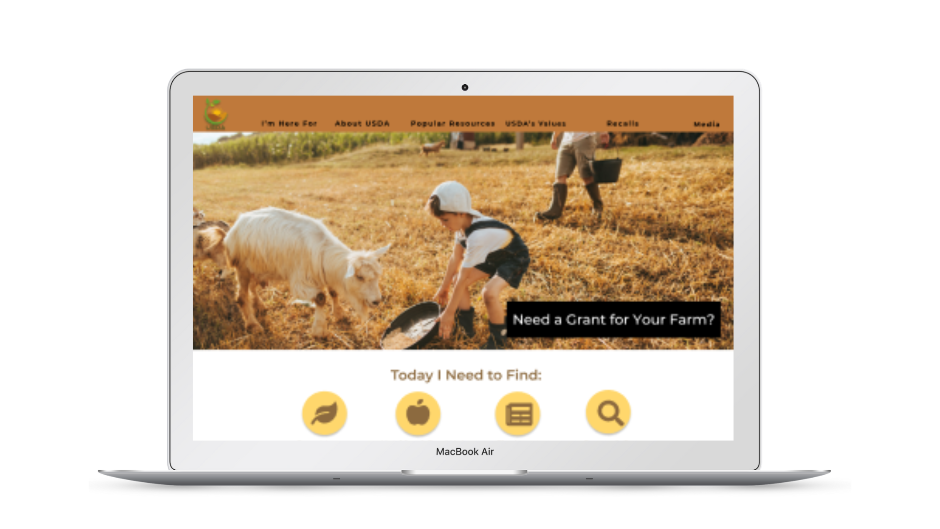
Desktop Prototype
A viewable version of the desktop prototype
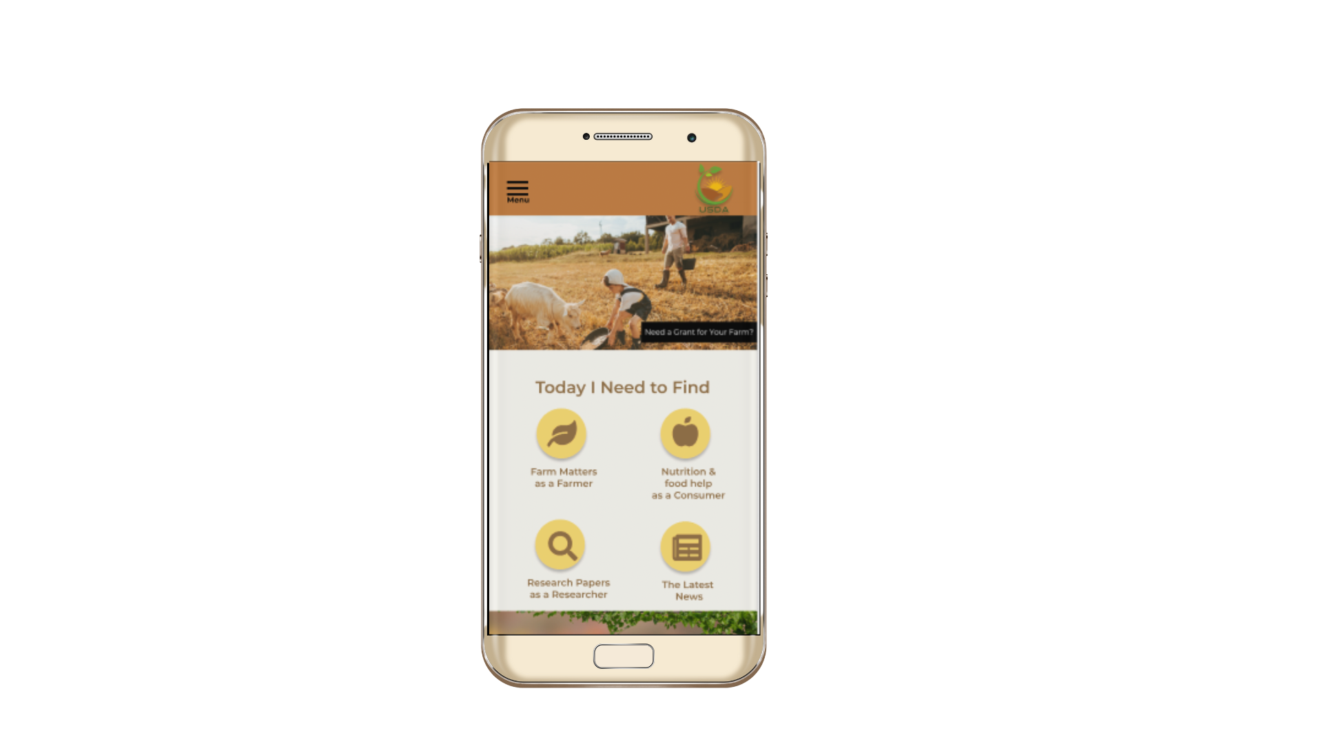
Mobile Prototype
A viewable version of the mobile prototype
