The goal was to create a custom logo and brand for a tea shop offering a custom sit-down experience and an array of teas from all over the world.
Project Title
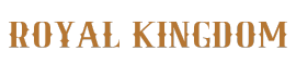
- Continental Tea Experience
Roles
- Brand Designer
- Logo Designer
Deliverables
- User Persona
- Ideation
- Sketches
- Mood Boards
- Logo
- Mock-ups
- Brand Guidelines
Software Used
- Adobe Illustrator
- Adobe Photoshop
- Procreate
Project
- Brand Design and Logo Creation
Project Overview
A local tea shop needs help creating a vintage-inspired brand and original logo.
Style & Imagery

Tea Leaf Green #023D26

Light Tea Green #046160

Saddle Tan #B57632
Lighter Saddle Tan #C49A6C

Brewed Tea #23110C


Body Text: Lora pt.16
Style direction: Vintage, natural, antique, romantic, classic
%
Millennials that drink tea
Females are more likely to drink tea than males
The average age of tea drinkers
%
More than 1/2 of Americans drink tea
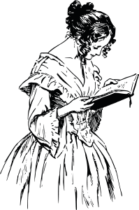
User Personas
User personas were created with the help of research and data and the client’s completed branding form.
From this, the ideal patrons were created. The data shows women consume tea more than men, and the age range of the typical tea drinker is 30-50.
The client form indicated that their target audience was tea enthusiasts and experience seekers who do not typically drink tea.

")
 (1)")
")

Mood Boards
Two mood boards were created to showcase to the client for them to select their style direction preference.
They preferred the “Romantic One” over the “Classic One,” but said they liked some elements in the “Classic One” such as the multi-dimensional tea leaves.


Word Mapping and Sketches
Word mapping was conducted to brainstorm what images came to mind with “Continental Tea Experience.” This helped to inform the sketching process. Sketches were constructed in Procreate to conceptualize the logo possibilities.
Early Concepts
Next, vectors were created in Adobe Illustrator and then applied to different font combinations and layouts to see the best logo possibilities.


")

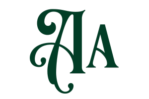
Choosing the Logo Direction
The client was given three logo concepts to choose from with the disclaimer that these are not the finalized colors, positions, textures, etc. They were choosing based on their preferred concept.
They opted for the first choice, saying that they were concerned the second option was too feminine and the third was too masculine. The first choice struck a balance between the two.
Finishing the Logo
The finished logo had the bronze styled texture included in the saucer that the client said they liked when they saw it included in the first set of mood boards.
Some color and layout tweaks were completed as well as creating a hatching pattern on the left side of the cup to create a more vintage styled logo per the client’s request.

